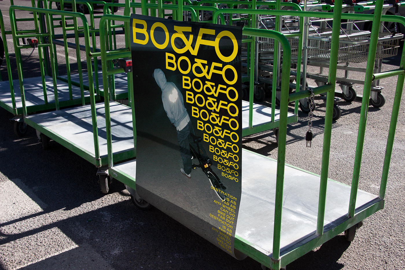
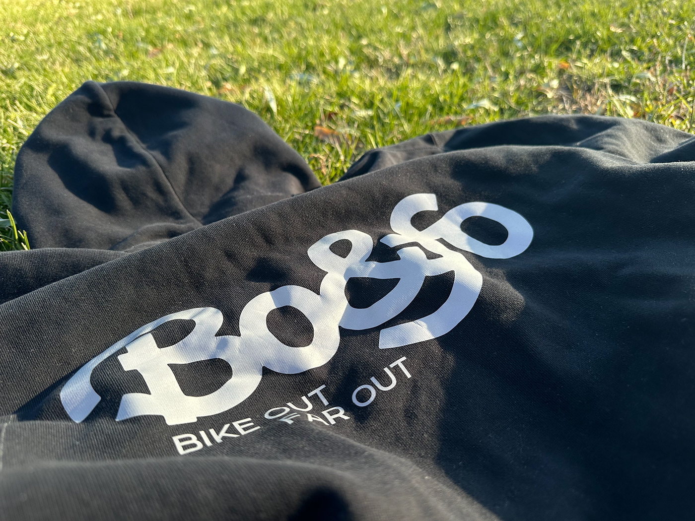
BO&FO是一个关于自行车骑行的品牌,主要围绕城市骑行人的生活周边进行产品开发。BO&FO是BIKE OUT & FAR OUT的缩写,即便身在城市,依旧心向远方,骑行带来的自由一直在生活里无处不在。
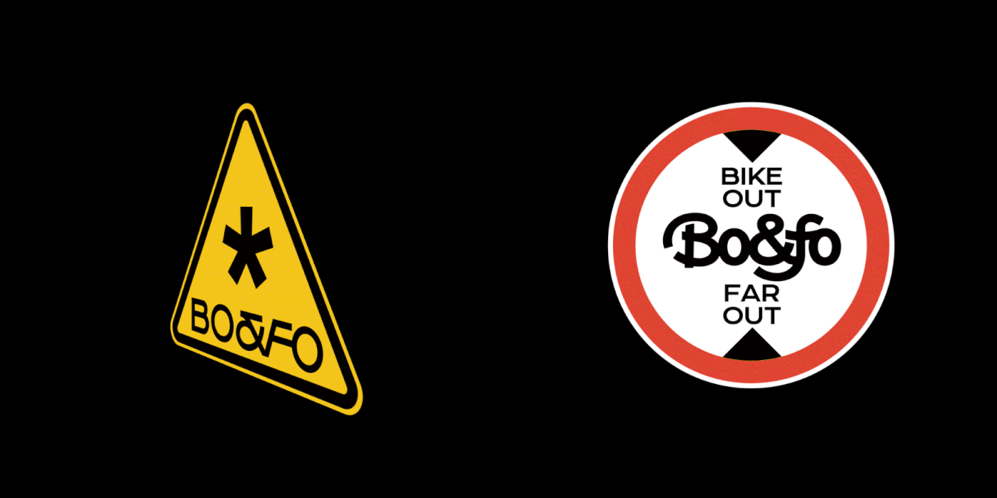
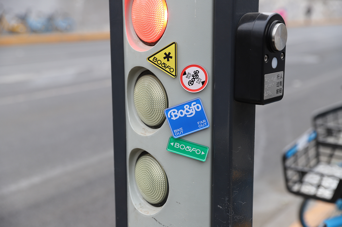
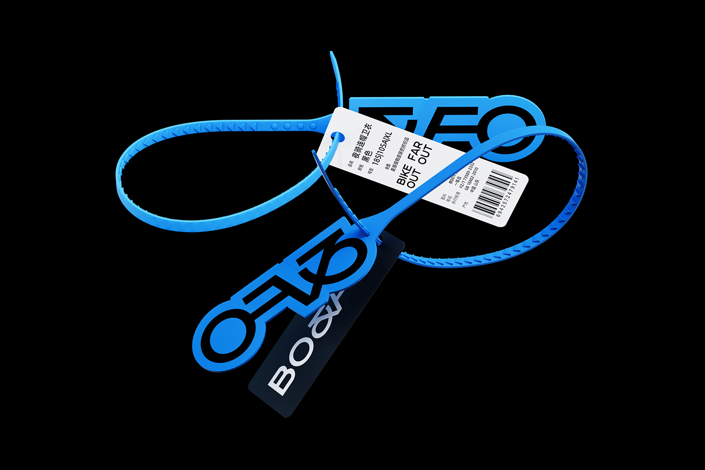
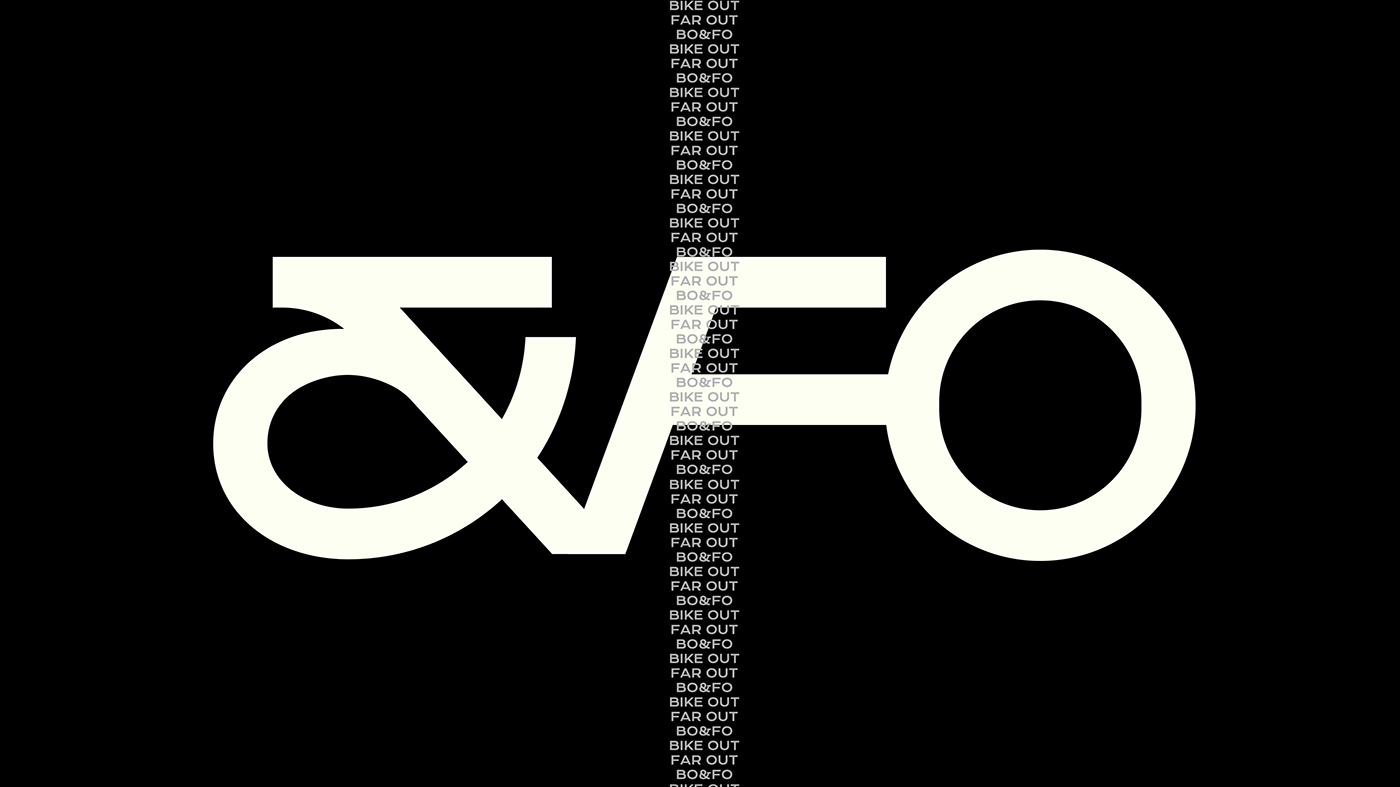
LOGO的图形由自行车形状演化并与&FO结合形成品牌的识别符号。
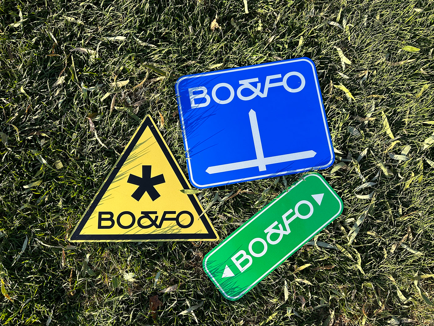
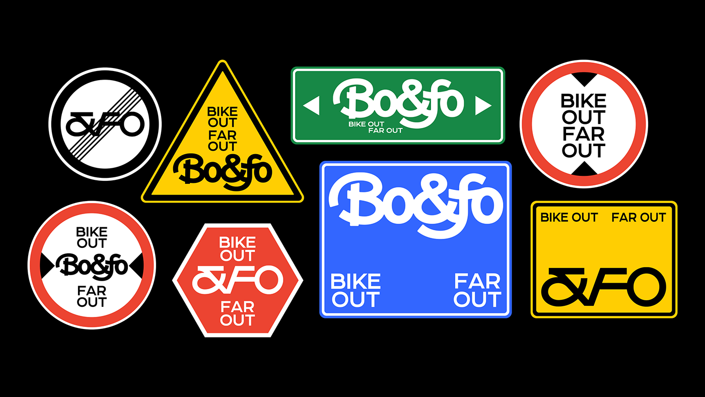
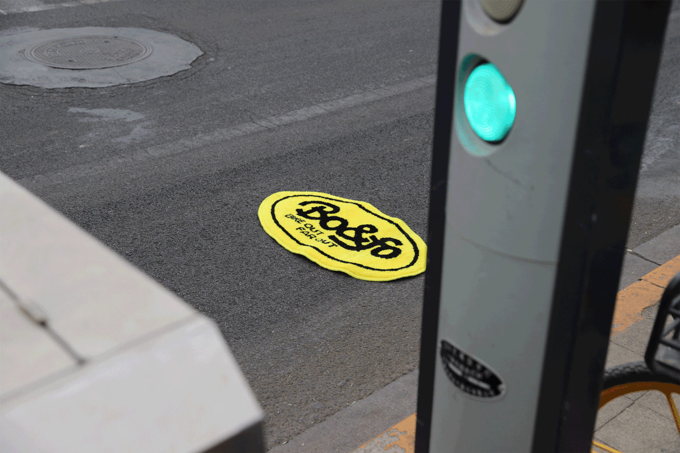
品牌的视觉语言体系整体围绕“路牌”来进行,骑车在路上,绿色的牌子往往写明了街道的名称与方向,蓝色的牌子示意着路所通向的方向,黄色三角牌多用来提醒可能产生的路况变化,以及各种各样的限高限行限速等等,这些城市中道路交通的符号成为了我们出门骑行重要的方位参考。同时也通过这些符号与品牌本身符号的结合,强化品牌内容信息。
BO&FO is a brand about bicycle riding. It mainly develops products around the lives of urban cyclists. BO&FO is the abbreviation of BIKE OUT & FAR OUT. Even if you are in the city, your heart is still far away. The freedom brought by cycling has always been everywhere in your life.
The graphic of the LOGO evolved from the shape of a bicycle and was combined with &FO to form the brand's identification symbol.
The brand's visual language system is centered around "street signs". When riding on the road, green signs often indicate the name and direction of the street, blue signs indicate the direction the road leads, and yellow triangle signs are often used as reminders. Possible changes in road conditions, as well as various height and speed limits, etc., these symbols of road traffic in cities have become important directional references for us when we go out to ride. At the same time, the brand content information is strengthened through the combination of these symbols with the brand's own symbols.